
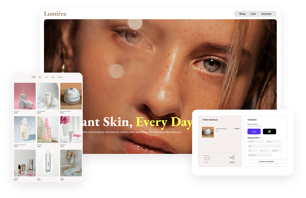
Lumiera is a conceptual skincare brand created to provide users with a seamless and premium online shopping experience. The goal was to design a website that reflects the elegance of modern skincare brands while making product discovery simple and intuitive. The project focused on creating a visually calming interface, reducing friction during shopping, and establishing trust through clean design and clear product presentation.
How might we design a premium skincare shopping experience that balances luxury aesthetics with ease of use?
Reduce Decision Friction in Product Discovery
Design a browsing and filtering experience that helps users find the right product for their skin type and concerns without feeling overwhelmed by choice.
Build Purchase Confidence Through Information Clarity
Surface ingredient transparency and trust signals right where users need them, not buried in secondary pages.
Streamline the Path from Discovery to Checkout
Minimize the number of steps and decisions between finding a product and completing a purchase, removing friction points that commonly cause cart abandonment in e-commerce.
To identify industry best practices and opportunities for improvement, I analyzed Rhode and Fenty Skin, focusing on branding, product discovery, and user experience.
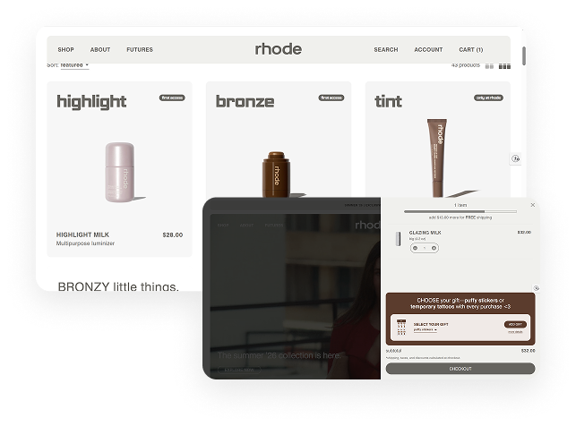
✓ Minimal and premium visual design
✓ Strong product-focused photography
✓ Consistent branding
Users must scroll further to access important product details, which can slow decision-making.
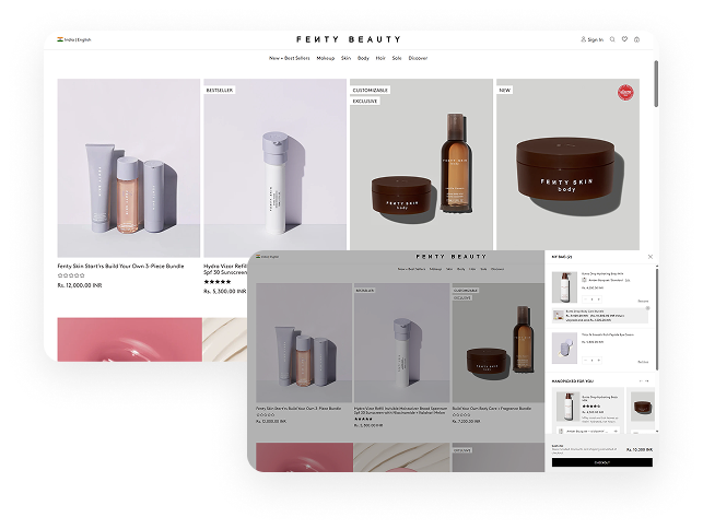
✓ Strong visual storytelling
✓ Engaging product presentation
✓ Distinct brand personality
Heavy visual content can make product browsing feel less efficient.
Emma is a busy marketing executive with an eye for skincare that works. Ingredient-conscious and skeptical of hype, she wants transparency about what's inside her products without spending hours researching.
• Find products for her skin concerns
• Understand ingredients before buying
• Feel confident in her purchase
• Overwhelming product information
• Unclear ingredients and benefits
• Hidden costs during checkout
• Clear ingredient breakdowns explained in plain language
• Product recommendations matched to her specific skin concerns
•Transparent pricing with no surprise costs at checkout
Sophia is a UX consultant who values efficiency in everything, including how she shops. She's a repeat
buyer who already knows what she wants — expecting a fast, frictionless path to reorderwithout
unnecessary steps.
• Quickly find familiar products
• Reorder with minimal effort
• Complete checkout efficiently
• Too many checkout steps
• Difficult product discovery
• Slow purchasing process
• Quick access to purchase history and past orders
• One-click or minimal-step reordering
• Streamlined checkout with as few clicks as possible
These principles guided every design decision throughout the project, ensuring the experience remained user-centered, intuitive, and aligned with the brand's premium identity.
Provide clear product information, pricing, and ingredients so users can make informed purchase decisions.
Present information progressively and prioritize the most important content first to simplify product selection.
Design seamless navigation, product discovery, and checkout flows that minimize friction throughout the shopping journey.
Use consistent layouts, typography, spacing, and interaction patterns to create a familiar and predictable experience.
Promote product discovery and recommendations without interrupting the user's primary purchasing journey.
Through competitor analysis and industry research, I identified several factors that influence users when shopping for skincare products online.
Product imagery, ingredient transparency, and clear information help users make confident purchasing decisions.
Product benefits, ingredients, and pricing should be easy to find and scan.
Users should be able to browse products without feeling overwhelmed.
Clean layouts and strong visual hierarchy contribute to a more luxurious shopping experience.
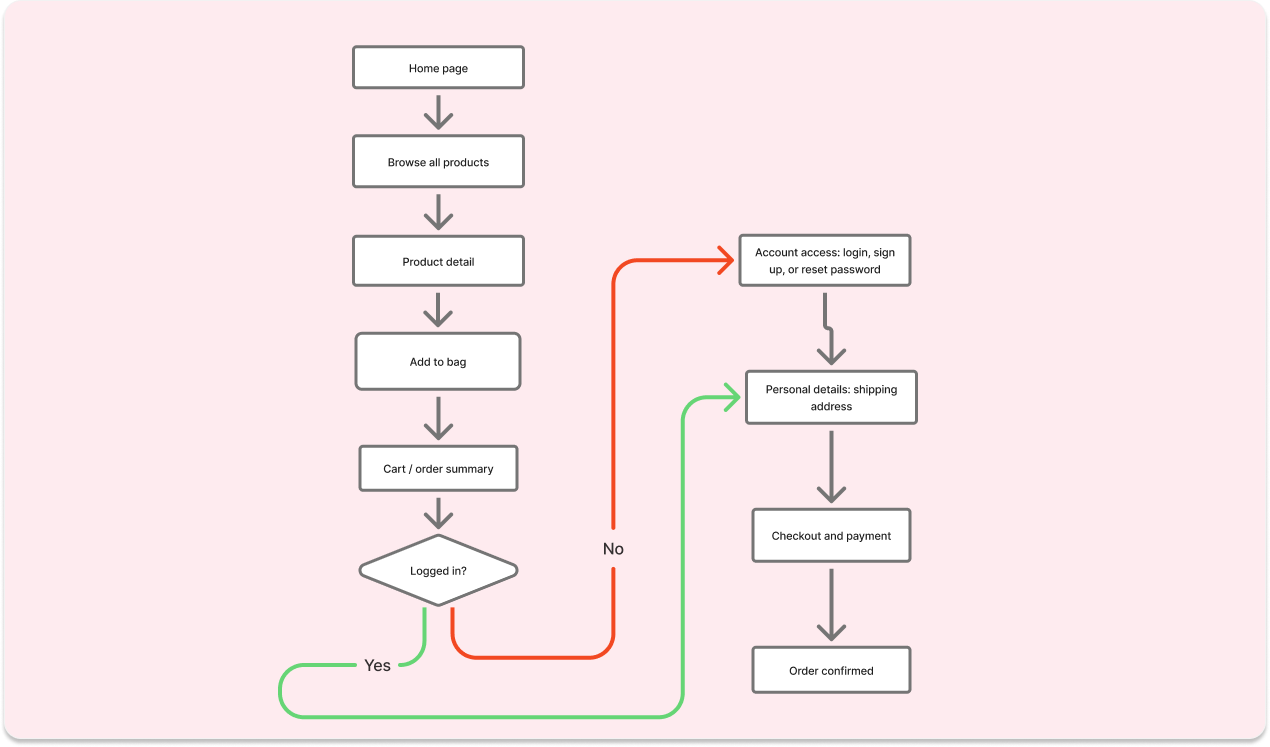
To create a seamless shopping experience, I mapped the primary user journey from product discovery to checkout. The flow focuses on reducing friction and helping users complete purchases efficiently.
Users need enough information to confidently choose a skincare product, but presenting too much information upfront can make browsing overwhelming and slow.
Adding detailed descriptions, ingredients, and benefits to the product listing page would help users compare products but increase cognitive load and reduce scannability.
I prioritized essential information such as product imagery, product name, category, and price on the listing page, while reserving detailed descriptions, ingredients, and usage information for the product detail page.
First-time shoppers often need education and reassurance before purchasing, while returning customers want to find products and check out as quickly as possible.
Designing only for new users would slow experienced shoppers, while optimizing only for returning customers could reduce confidence for first-time buyers.
The experience combines brand storytelling and educational product pages with a streamlined navigation and checkout flow, allowing users to choose the level of information they need.
A premium aesthetic can help build brand trust, but leaning too heavily into lifestyle imagery over product substance can make it harder for users to evaluate whether a product is actually right for them.
Prioritizing brand storytelling strengthens emotional connection, whereas prioritizing product listings supports faster shopping.
The homepage balances both objectives by introducing the brand through a hero section and featured collections while keeping product categories and shopping entry points easily accessible.
A shorter checkout process reduces friction, but users still need reassurance before completing a purchase.
Removing too much information could make checkout faster but reduce confidence by hiding important pricing and order details.
The checkout flow uses a simplified form while keeping the order summary, pricing breakdown, and payment information visible throughout the process to support informed purchasing decisions.
The visual system was designed to reflect the elegance and simplicity of modern skincare brands. Soft neutrals, spacious layouts, and refined typography were used to create a luxurious shopping experience.
Hero headlines, section headings, major titles
Product names and featured product titles
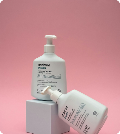
Create a premium first impression while helping users discover products quickly and effortlessly.
Large hero imagery paired with elegant typography to communicate a luxury skincare experience.
Users can navigate products through clear skincare categories such as Face Cream, Face Mask, and Body Care.
An introduction section communicates the brand's values and builds trust with users.
Minimal navigation reduces cognitive load and keeps the focus on products.
The homepage balances aesthetics and usability by combining premium visuals, clear hierarchy, and intuitive product discovery.
.png)
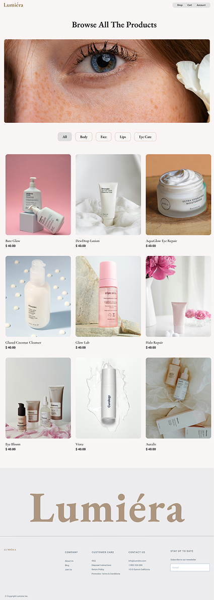
Enable users to browse, compare, and discover skincare products efficiently through clear categorization and visual hierarchy.
Quick filter chips allow users to narrow products by skincare category.
Large product imagery helps users evaluate products before opening detailed pages.
Product names and pricing are displayed clearly to support faster decision-making.
A structured three-column layout improves browsing and comparison.
Editorial imagery reinforces the premium skincare brand experience.
The product listing page balances aesthetics and usability, allowing users to discover products quickly while maintaining a premium shopping experience.
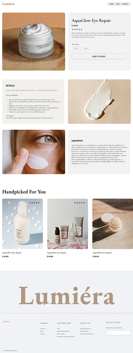
Provide users with all the information needed to make a confident purchase decision while maintaining a clean and premium shopping experience.
Large product imagery immediately draws attention to the product and showcases details clearly.
Product name, pricing, size selection, and Add to Bag CTA are positioned above the fold for faster decision-making.
Benefits, usage details, and key product features help users understand the value of the product.
A dedicated ingredients section builds trust and supports informed purchasing.
Recommended products encourage additional product discovery and increase engagement.
The product detail page combines informative content with a streamlined purchase flow, helping users evaluate products quickly and proceed to checkout with confidence.
Provide users with a clear overview of selected products before checkout while minimizing friction in the purchasing process.
.png)
Product details, quantity controls, and pricing are displayed in a clean and organized structure.
Users can quickly adjust product quantities without leaving the cart
Subtotal is clearly visible to help users understand costs before checkout.
A full-width checkout button creates a clear next step and encourages conversion.
The interface focuses only on essential information needed to complete the purchase.
The cart experience turns reviewing your order into a natural continuation of the browsing journey, rather than a separate, disconnected step.
Create a frictionless checkout experience that allows users to complete their purchase quickly and confidently.
%202%20(1).png)
Separates order summary from checkout details, helping users review information without losing context.
Product details, pricing, discounts, and total cost remain visible throughout the checkout process.
Quick payment methods reduce checkout time and support faster conversions
Shipping information is organized into logical groups to improve form completion.
A prominent call-to-action guides users to the next step without distraction.
The checkout experience simplifies the final purchase stage by combining clear information hierarchy, transparent pricing, and streamlined form completion.
Provide users with a simple and secure way to create accounts, access existing profiles, and recover passwords.
%201.png)
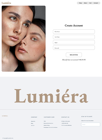
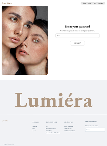
All authentication screens follow the same visual pattern to reduce learning effort.
Only essential fields are displayed to simplify completion.
Users can easily switch between login, registration, and password recovery.
Lifestyle imagery reinforces the premium brand experience.
Each screen contains a single primary goal and CTA.
The account experience gives users a simple, secure way to manage access without adding unnecessary friction to the shopping journey.
Designed a complete shopping experience from product discovery to checkout, ensuring a seamless and intuitive user journey.
Applied insights from competitor analysis and industry research to make informed design decisions that aligned with user expectations.
Learned how thoughtful content organization and visual hierarchy help users navigate products, understand information, and make decisions faster.
Explored how luxury-inspired visuals can coexist with usability principles to create an experience that feels both premium and functional.
Built an e-commerce experience that helps users quickly browse categories, explore featured products, and connect with the WaveRider brand through a visually immersive journey.
%201.png)