
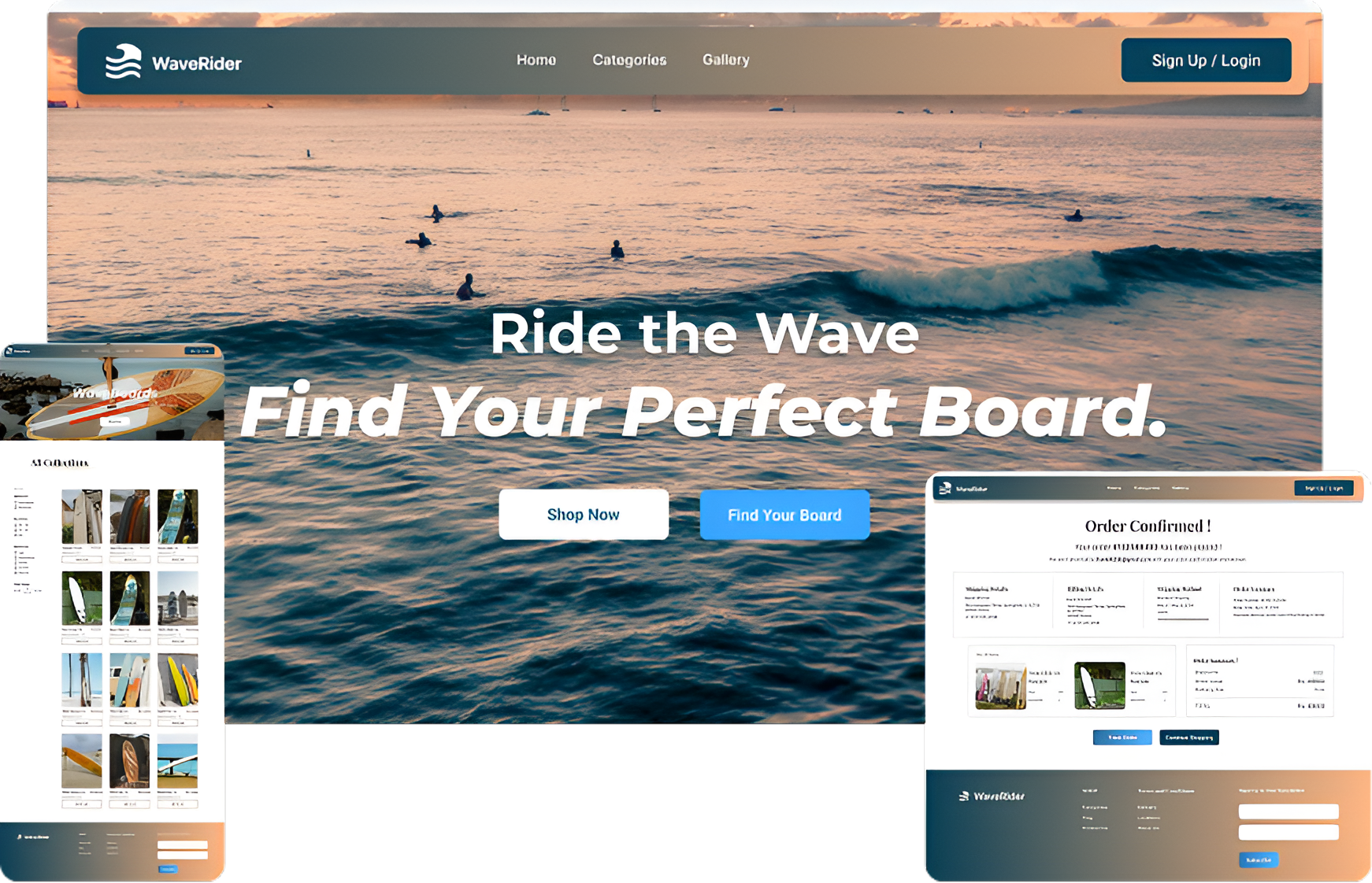
WaveRider is an e-commerce platform designed to make discovering and purchasing surfboards easier through a focused and engaging shopping experience. The platform brings product discovery, exploration, and purchasing into one seamless journey, with clear navigation and accessible product information to help users find the right surfboard with confidence.
How might we make it easier for users to discover, evaluate, and choose the right surfboard without feeling overwhelmed by too many options?
Help users efficiently navigate a broad range of surfboards and identify products relevant to their needs without unnecessary browsing.
Make essential product information easy to scan and understand, helping users evaluate their options before committing to a purchase.
Create a connected experience from discovery to product evaluation and checkout, minimizing unnecessary steps and keeping users oriented throughout the journey.
To understand existing surfboard e-commerce experiences and identify opportunities for a more focused shopping journey, I analyzed Surf Station and Cleanline Surf, focusing on catalog complexity, product discovery, and information hierarchy
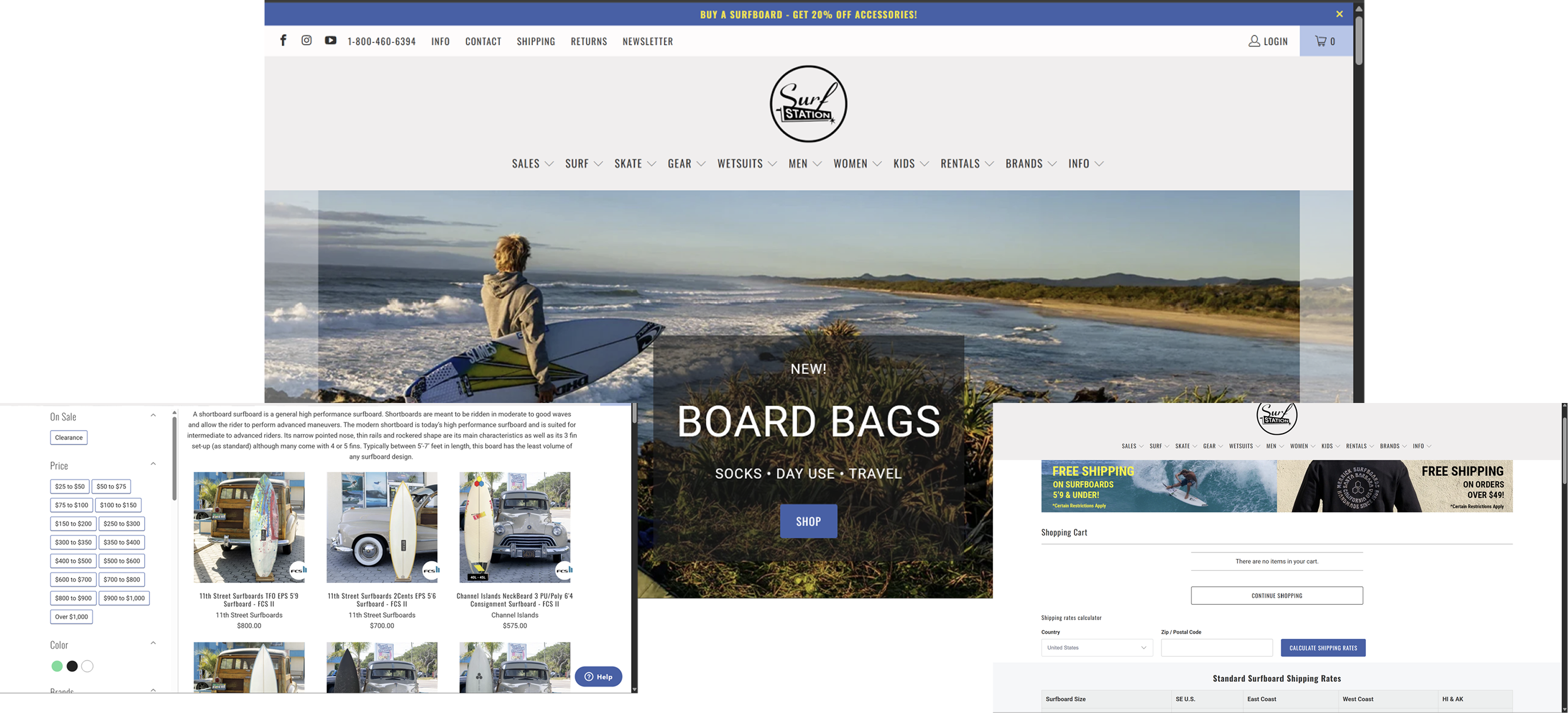
✓ Broad surfboard selection
✓ Clear product categorization
✓ Useful filtering for product discovery
A large product catalog can make it difficult for users to narrow down choices and understand which surfboard best fits their needs.
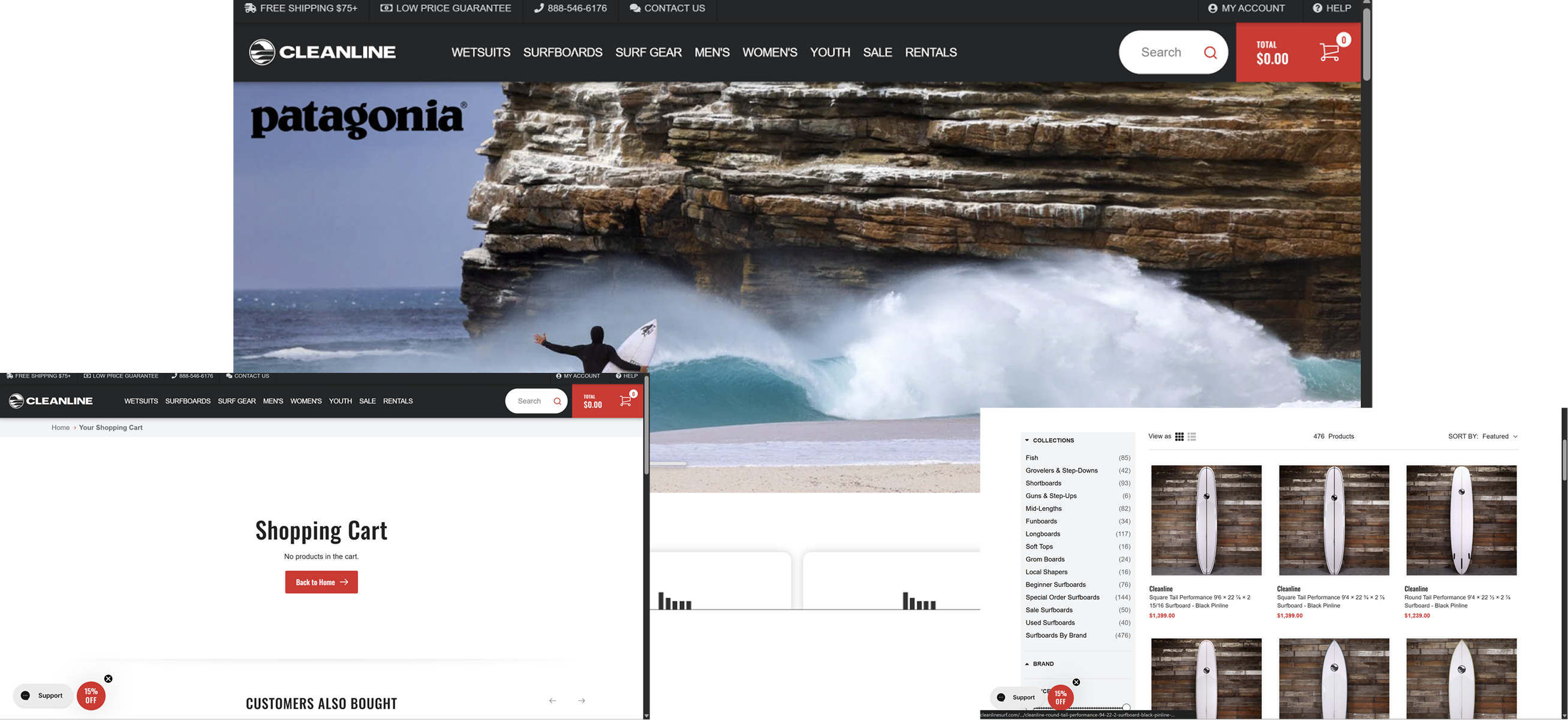
✓ Detailed product specifications
✓ Strong product information
✓ Supports informed product evaluation
Detailed specifications can create information overload, making it harder for users to quickly identify the information most relevant to their purchase decision.
Maya is new to surfing and just started learning to ride waves. She's eager but easily overwhelmed by
technical gear talk, and wants guidance that's simple and beginner-friendly — helping her choose confidently
without needing expert knowledge.
•Find a surfboard suited to her skill level
• Understand products without technical jargon
•Compare a few suitable options
• Learn key board specifications before buying
•Feel confident about her purchase decision
• Unsure which type of surfboard to choose
• Technical specifications can be difficult to understand
•Too many products make comparison overwhelming
•Difficult to know which features matter most
• Skill-level based product recommendations
• Simple explanations of technical specifications
•Relevant filters to narrow down choices
•Clear comparison between suitable boards
Alex has surfed for 15+ years and rides everything from longboards to shortboards. Gear-savvy and detail-oriented, Alex researches thoroughly and trusts specs over marketing copy — wanting a fast, focused shopping experience that respects their expertise.
• Quickly find boards matching specific preferences
• Compare technical specifications efficiently
• Filter out irrelevant products
• Evaluate boards before making a purchase
• Find the right product without unnecessary browsing
•Too many irrelevant products slow down discovery
• Important specifications can be difficult to scan
•Comparing products requires repeated browsing
•Product information can be spread across different sections
• Clear, structured spec sheets in one placeSkill-level based product recommendations
• Filters that reflect real surfing criteria (skill level, wave type, board shape)
•Side-by-side comparison between shortlisted boards
•Trustworthy reviews from other experienced surfers, not generic ratings
These principles guided the key design decisions throughout WaveRider, from information hierarchy to product discovery and purchase flow.
Structure discovery and product information so users can make decisions without feeling overloaded by too many options.
Present products and their key attributes in a way that helps users quickly evaluate differences and narrow down their choices.
Surface the specifications and details that matter most during product evaluation, while keeping deeper information accessible when needed.
Reduce unnecessary friction between product discovery, evaluation, and checkout so users can move confidently toward purchase.
When product lists become broad, filtering, sorting, and category structure become important for helping users narrow their options and maintain an overview of available products.
Product pages are a key point in the purchase journey, making clear imagery, relevant descriptions, specifications, and purchase actions important for helping users evaluate an item.
Surfboards come with technical attributes that can be useful for experienced buyers but overwhelming for beginners. The interface therefore needs to prioritize decision-relevant information while keeping deeper specifications accessible.
Users should be able to move naturally from browsing and narrowing options into detailed product evaluation, rather than treating these as disconnected stages. This makes navigation, product listings, and product pages part of one larger product-finding experience.
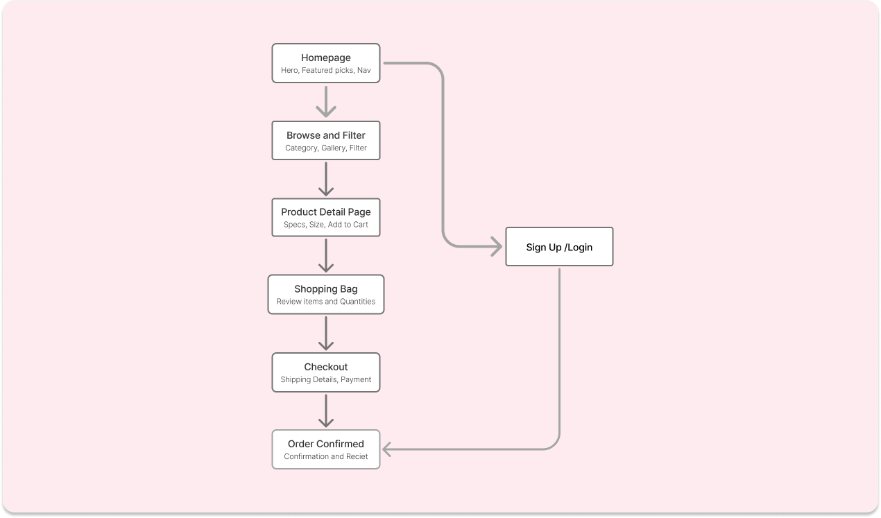
To design an intuitive shopping experience, I mapped the primary user journey from discovering a board to completing a purchase, focusing on reducing friction and helping buyers move quickly between decision points.
A surfboard catalog can contain many products with different shapes, sizes, specifications, and intended use cases. Giving every product attribute equal visual emphasis can make the browsing experience difficult to scan.
Showing more specifications directly on the product listing could help experienced surfers evaluate products faster, but it would increase information density and make the experience harder for newer users to navigate.
I prioritized essential information such as product imagery, board name, type, and price on listing cards, while reserving deeper specifications and product information for the product detail page.
Beginners may not have enough product knowledge to understand technical surfboard terminology, while experienced surfers may want access to detailed specifications.
Simplifying all product information would make the experience more approachable but could remove valuable details for experienced users.
I structured product information in layers, presenting the most relevant details first while allowing users to explore deeper specifications when they need them.
Users move through different stages of intent, from casually exploring surfboards to actively evaluating a specific product and eventually purchasing it.
Using the same interaction patterns throughout the experience would keep the interface consistent, but would not adequately support the changing needs of users at each stage.
I designed the experience around the user's progression from discovery to evaluation to purchase, giving each stage the information and actions needed to move forward.
The experience needs to carry users from product evaluation into purchase without making the final steps feel disconnected from the browsing experience.
Adding more confirmation steps and information could give users greater control, but it could also interrupt momentum and make checkout feel unnecessarily complex.
I kept the purchase journey focused by maintaining clear product context, making key order information easy to review, and keeping the path from adding a product to completing the purchase straightforward.
A scalable design system was established to create consistency, hierarchy, and a cohesive experience across the product.
Main Homepage Heading
Subheadings, Product names and featured product titles
Paragraphs & Supporting Text
-Picsart-AiImageEnhancer.png)
Create a focused entry point that helps first-time visitors — many of whom don't know surfboard terminology — quickly find a board suited to their skill level without feeling overwhelmed by choice.
Placed guided discovery (skill-level and board-type entry points) directly below the hero, giving undecided buyers an immediate path forward instead of forcing them into a full catalog first.
Full-bleed ocean and rider imagery throughout the homepage creates an emotional, aspirational entry point before any technical decision-making begins — appropriate for a considered, lifestyle-driven purchase.
Sequenced the page as hero → guided discovery → featured products ("Wave Favorites") → brand story → social proof (testimonials), so trust-building content supports the purchase decision rather than competing with it.
The homepage transforms a potentially intimidating, spec-heavy category into an approachable entry point, letting visitors self-select into the right board type before ever reaching a product page.
.png)
Give visitors who don't want to commit to a single board category upfront a single place to browse, filter, and compare across the entire catalog — longboards, shortboards, and everything between.
Combined Skill Level, Board Size, Board Style, and Price Range into one filter panel that spans every category, so a user isn't forced to pick a collection before they can start narrowing down.
Reused the outline "Add to Cart" card pattern from the category-specific pages, so switching from a filtered category view to the full catalog feels like the same product, not a different tool.
Sits one level above the category pages (Shortboards, Longboards) in the site's navigation — for buyers who'd rather filter their way to a board than pick a category first.
The all-collections page gives less-decided buyers a single, filterable entry point into the full catalog, complementing — rather than duplicating — the category-specific browse pages.
%20(1).png)
Give buyers who already know they want a longboard a focused page to browse and filter within that single category, rather than sifting through the full catalog.
Skill Level, Board Size, and Board Style are all scoped to longboard-relevant options (Beginner/Intermediate, 8'0–9'0+, Classic/Soft-Top/Nose Rider) — distinct from the shortboard filter set, because the criteria that matter change by category.
Smooth, stable, and perfect for effortless rides... ideal for beginners" tells a first-time buyer why this board fits them, not just what it's called.
Same outline "Add to Cart," same 3-column grid, same gradient header/footer — so this reads as one consistent site, not a separate microsite.
The category page lets committed longboard buyers filter within a relevant, focused option set, sitting one level below the "All Collections" browse page for users who already know what they want.
.png)
Give buyers enough technical and reassurance-based information to confidently purchase a board sight-unseen, especially first-timers unfamiliar with surf terminology.
Add to Cart uses the outline treatment, Buy Now stays solid black — the low-commitment vs. immediate-purchase distinction established earlier carries through correctly here.
Specifications (hard facts) and Ideal Conditions (who it's for) sit side by side, followed by About This Board (story) and Care Instructions (post-purchase confidence) — separating what it is from why you'd want it rather than dumping everything into one paragraph.
Free Shipping, Premium Packaging, 30-Day Returns, and Craftsmanship Guarantee appear directly below the content, right before the user would scroll back up to buy — reinforcing confidence at the natural hesitation point.
The PDP balances technical detail with reassurance, giving both experienced and first-time buyers what they need to commit — without needing to leave the page.
.png)
Let users review, adjust, and trust their order before committing to checkout — the last low-stakes step before payment.
Each line item has its own stepper and trash icon directly below the product info, so adjusting an order doesn't require navigating elsewhere.
Lines like "Prices and delivery costs are not confirmed until you've reached checkout" and the 15-day returns note pre-empt cart-abandonment triggers — addressing hesitation before it happens rather than after.
A clear divider separates the editable cart from the Order Value / Delivery / Total summary and the single black "Continue to Checkout" button — so the page has one obvious next action despite showing multiple editable items above it.
The cart reduces last-minute doubt by surfacing policy and delivery information upfront, while keeping editing and checkout as clearly separated, low-friction steps.
.png)
Let the user select a payment method and complete purchase with minimal friction, while keeping the order visible for a final gut-check before paying.
Cart contents, pricing breakdown, and total stay on-screen throughout checkout — so the user never has to trust a number from a previous screen or navigate back to double-check what they're paying for.
Credit Card, PayPal, GPay, and Cash on Delivery are collapsed into consistent, equal-weight rows with a chevron affordance — familiar UI (matches most mobile payment flows) that keeps the page uncluttered until a method is chosen.
Pay Now" is solid black, consistent with "Buy Now" on the PDP — reinforcing that black = the final, most committed action across the whole site, not just one page.
Checkout completes the purchase flow with a single, focused decision (payment method) while keeping cost and order details transparent the entire time.
.png)
Reassure the buyer their order went through correctly and give them clear next steps, closing the loop after a multi-step purchase flow.
Shipping, Billing, Shipping Method, and Order Summary sit in a single four-column layout — so a buyer double-checking their address or payment method doesn't need to dig through email or account pages.
Track Order" and "Continue Shopping" give the user a clear choice based on intent (post-purchase anxiety vs. browsing momentum) rather than forcing everyone down a single path
Same layout, same total, same line-item structure as the cart and checkout screens — reinforcing that nothing changed between "I agreed to pay this" and "this is what I paid," which matters for trust at the final step.
The confirmation screen closes the purchase loop with full transparency and a clear fork for what to do next, rather than leaving the user stranded after payment.
.png)
Get returning and new users authenticated with minimal friction, using a split-screen layout that keeps the brand visually present even on a purely functional screen.
Full-bleed lifestyle photography on the right balances the plain form on the left, so even a sign-up screen doesn't feel disconnected from the rest of the site's visual identity.
Google and Apple sign-in sit below a clear "Or sign in with" divider, positioned as an alternative rather than competing with the primary email/password flow — reducing decision fatigue on first load.
Just Email and Password, no extra friction (name, phone, etc.) at the sign-up stage — appropriate for a screen whose only job is getting the user in.
The sign-up screen balances simplicity and brand consistency, reducing friction for account creation while keeping the page visually aligned with the rest of the site.
.png)
Build emotional connection and brand aspiration through lifestyle imagery, giving visitors a reason to engage with the brand beyond pure product browsing.
One full-width hero shot followed by a 2-column grid breaks the rhythm of the rest of the site (which is largely uniform 3-column product grids), signaling that this page is about visual storytelling, not transactional browsing.
No prices, no "Add to Cart," no filters — the Gallery is the one screen in the funnel with zero purchase pressure, giving visitors permission to just look, which supports brand affinity earlier in the journey (homepage → gallery → shop, rather than forcing every page toward conversion).
The gradient nav bar and full-bleed hero image match every other page's pattern, so despite having a very different purpose, the Gallery still feels like part of the same site rather than a detour.
The Gallery gives WaveRider a non-transactional touchpoint that builds brand trust and lifestyle association, complementing the commerce-focused pages elsewhere in the site.
%20(1).png)
A single button hierarchy (black = primary, outline = secondary) applied across every screen made inconsistencies easy to spot and fix.
The same collection-page layout worked across Shortboards, Longboards, and All-Collections because filters and copy changed per category, not the structure itself.
A duplicate cart item slipping across cart, checkout, and confirmation was a reminder that polish means nothing if the numbers don't hold up.
The Gallery page, with zero commerce UI, showed that brand affinity can support conversion just as much as a well-optimized funnel.
Designed a recruiting dashboard that surfaces AI-recommended candidates, upcoming interviews, and pending reviews in one clear, actionable view for hiring teams.
.png)