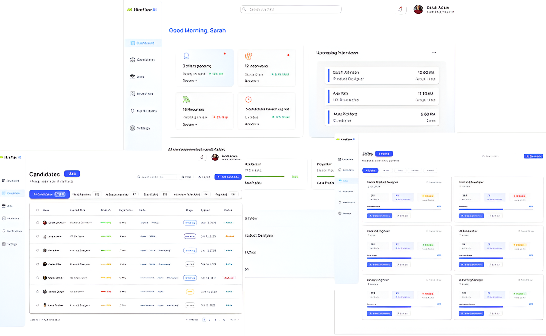
HireFlow AI is a conceptual recruitment platform designed to simplify hiring through AI-powered prioritization. It helps recruiters manage candidates, identify top applicants, schedule interviews, and track hiring progress in one place. Instead of overwhelming users with information, HireFlow surfaces what matters most and turns it into clear, actionable next steps.
How might we help recruiters quickly identify what needs their attention and prioritize the right candidates?
Help recruiters quickly identify high-potential candidates using AI-assisted recommendations.
Make urgent interviews, follow-ups, and tasks visible without requiring recruiters to search for them.
Bring candidates, hiring stages, and key actions into one focused workspace.
To understand existing recruitment workflows and identify opportunities for a more focused experience, I analyzed Greenhouse and Lever, focusing on workflow complexity, candidate prioritization, and information hierarchy.
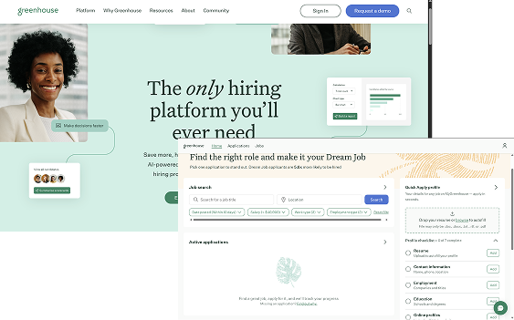
✓ Structured hiring workflows
✓ Clear candidate pipeline management
✓ Strong hiring process organization
Complex workflows can make it difficult for recruiters to quickly identify what needs attention.
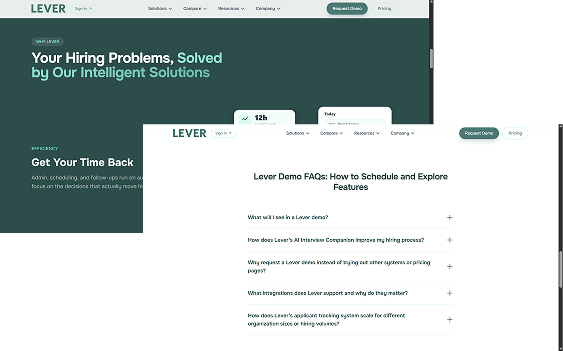
✓ Strong collaboration features
✓ Good candidate management
✓ Supports team-based hiring
Information-heavy screens can increase cognitive load when recruiters need to make quick decisions.
Sarah manages multiple hiring pipelines, screening candidates, coordinating interviews, and updating
hiring progress. Most of her time is spent handling high application volume and switching between
tasks, leaving less time for actual candidate evaluation.
• Quickly screen and prioritize candidates
• Manage multiple open positions
• Schedule and track interviews
• Keep hiring pipelines organized
• Reduce repetitive manual work
• Too many applications to review
• Difficult to identify high-potential candidates quickly
• Multiple tasks competing for attention
• Candidate information spread across different workflows
• Clear hiring overview and priorities
•AI-based candidate ranking
• Centralized candidate tracking
•Quick access to urgent tasks
Andrew is responsible for making final hiring decisions for key roles within his team. He depends
on recruiters for sourcing but needs a clear, quick view of shortlisted candidates to assess fit
and skills.With limited time, he prefers concise and relevant candidate information that is easy to
compare without going through lengthy profiles.
• Review shortlisted candidates efficiently
• Understand candidate strengths and fit
• Collaborate with recruiters
• Make confident hiring decisions
• Track progress on important roles
• Limited time to review candidates
• Too much information without clear prioritization
• Difficult to compare candidates quickly
• Lack of context when reviewing shortlisted candidates
• Concise candidate summaries
•Clear comparison of key candidate attributes
•AI-generated insights to support evaluation
•Easy access to recruiter recommendations
These principles guided the key design decisions throughout HireFlow AI, from information hierarchy to AI recommendations and task management.
Surface the most important candidates, tasks, and actions first so recruiters can immediately understand where to focus.
Keep complex recruitment information organized and easy to scan without overwhelming users with unnecessary details.
Use AI to surface useful recommendations and insights that support recruiter decisions rather than simply adding another layer of information.
Every screen should help recruiters understand what they can do next and move candidates through the hiring process efficiently.
Competitive analysis showed an opportunity to move away from information-heavy recruitment experiences and make priority candidates and tasks more prominent.
Reviewing existing recruitment workflows highlighted the importance of surfacing decision-critical information without requiring users to open every candidate profile.
Mapping the recruitment workflow revealed several recurring actions — reviewing candidates, scheduling interviews, following up, and moving candidates through stages.
The analysis suggested that an AI score is more useful when paired with the information needed to understand a candidate's fit.
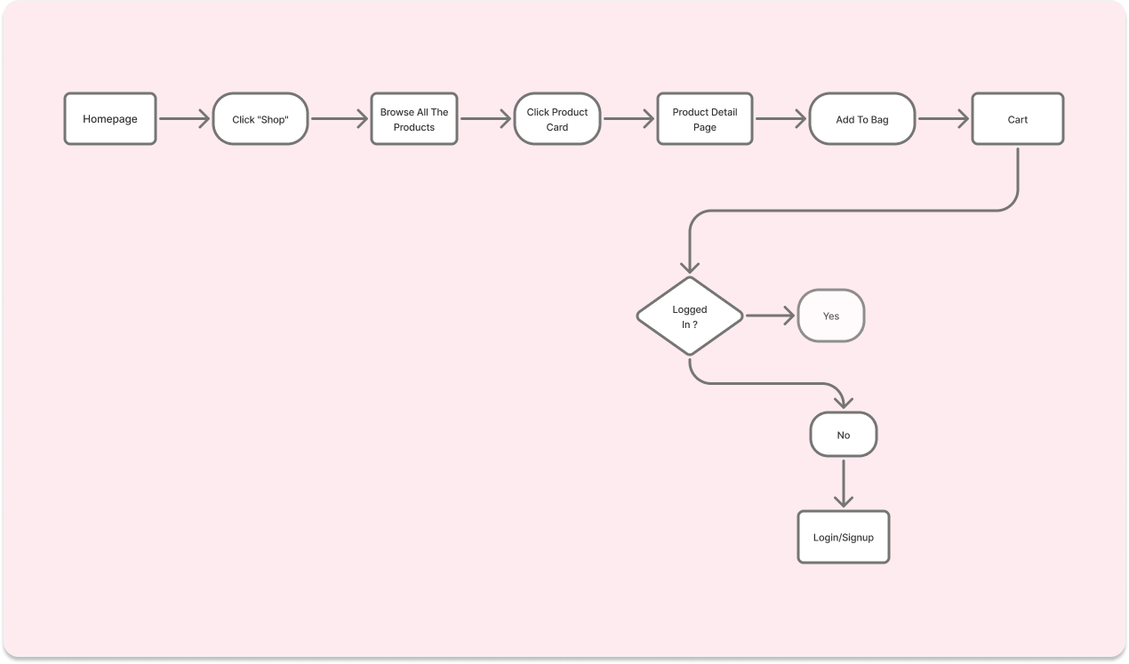
To design an intuitive recruiting experience, I mapped the primary user journey from reviewing a candidate to scheduling an interview, focusing on reducing friction and helping recruiters move quickly between decision points.
Recruitment dashboards can contain candidates, interviews, tasks, hiring stages, and activity all at once. Giving everything equal visual weight makes it difficult to know where to start.
Giving every task, candidate, and activity equal prominence would provide more visibility but create a cluttered dashboard and make urgent actions harder to identify.
I prioritized “Needs Attention Today” and high-priority candidate information, while keeping secondary activities and broader hiring insights lower in the visual hierarchy.
Recruiters need to assess multiple candidates efficiently, but opening every candidate profile to find basic information adds unnecessary time to the screening process.
Showing more candidate information directly in the candidate list would reduce navigation but make each candidate card denser and harder to scan.
I prioritized AI Match Score, experience, skills, and current hiring stage on the candidate overview, while keeping detailed candidate information within the profile page
AI can help recruiters reduce manual screening, but a recommendation without enough context can make it difficult to understand why a candidate has been prioritized.
Showing more AI-generated information could make recommendations more transparent, but too much explanation would add complexity and compete with the information recruiters actually need to make decisions.
I used the AI Match Score alongside relevant candidate information to provide quick context while keeping the recruiter responsible for the final decision.
A recruitment platform needs to support complex workflows and provide a lot of information without overwhelming recruiters.
Displaying more information upfront would reduce the need to navigate deeper into the product, but it would also increase visual density and make important information harder to find.
I created a layered information hierarchy, keeping decision-critical information visible upfront while moving detailed candidate data, activity, and supporting information into deeper screens.
A scalable design system was established to create consistency, hierarchy, and a cohesive experience across the product.
Hero headlines, section headings, major titles
Product names and featured product titles
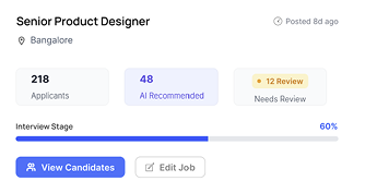

Create a focused starting point that helps recruiters quickly understand what requires their attention and prioritize their next actions.
Placed urgent tasks and high-priority candidates prominently to give recruiters an immediate starting point.
Used AI Match Scores and recommendations to help recruiters identify promising candidates without manually reviewing every applicant.
Grouped hiring overview, priority actions, and recent activity according to their importance rather than giving every section equal visual weight.
The dashboard transforms a potentially information-heavy recruitment workflow into a focused overview, allowing recruiters to quickly identify priorities and decide what to do next.
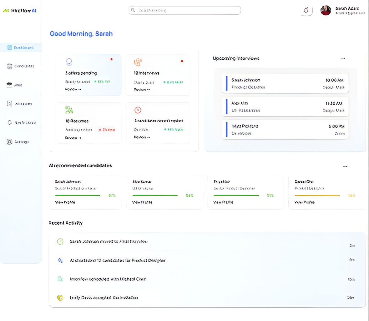
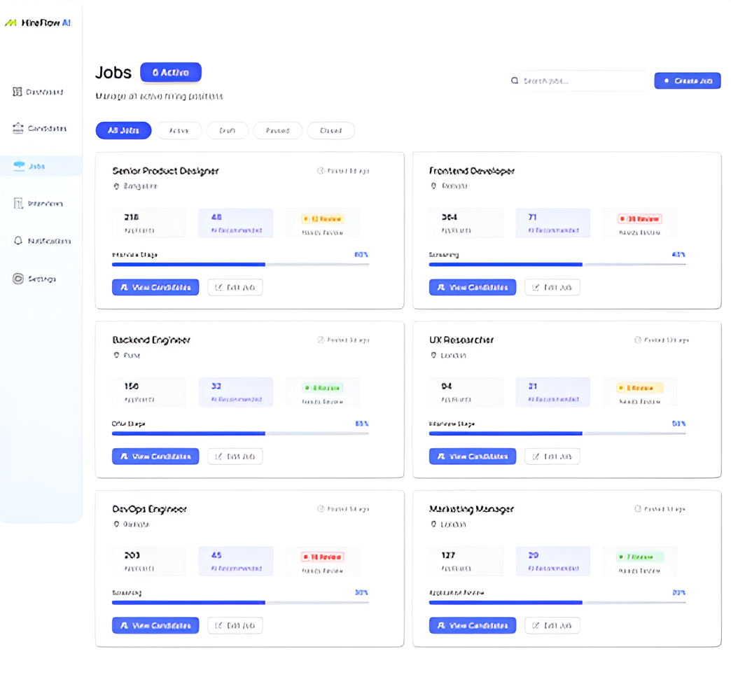
Enable recruiters to scan and compare candidates efficiently without opening every individual profile.
Displayed AI Match Score, experience, skills, and hiring stage directly within the candidate overview.
Organized candidate information into easily scannable sections instead of relying on a dense table.
Made it easier to narrow the candidate pool and find relevant applicants as the number of candidates grows.
The candidate overview reduces unnecessary navigation and gives recruiters the information needed to make an initial assessment quickly.
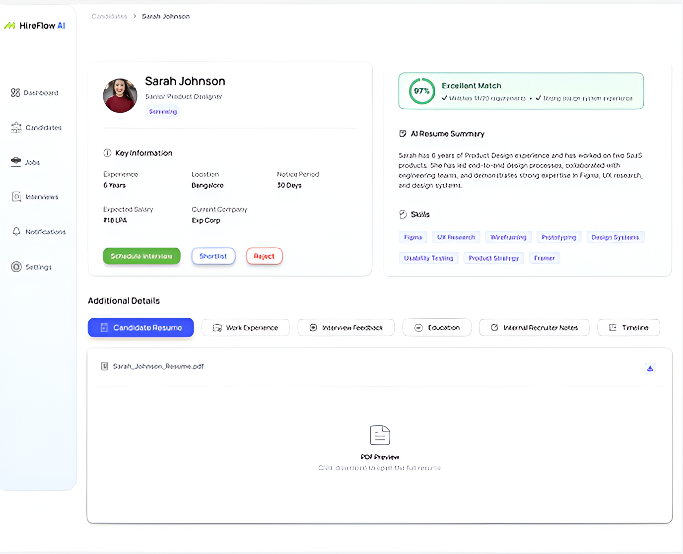
Provide enough candidate context for recruiters to evaluate fit and confidently decide on the next step.
Presented the AI Match Score alongside skills, experience, and other relevant information instead of treating the score as a standalone recommendation.
Separated key candidate details, AI summary, experience, and hiring information to make the profile easier to scan.
Made actions such as scheduling an interview or progressing the candidate easy to locate.
The profile provides a deeper view of candidate fit while keeping evaluation and next-step actions within the same workflow.
Reduce friction between deciding to interview a candidate and scheduling the interview.
Allowed recruiters to move directly from candidate evaluation to scheduling without unnecessary navigation.
Focused the interface on the information needed to select and confirm an interview.
Used visual hierarchy to make interview confirmation the obvious next step.
The scheduling experience turns a traditionally separate task into a natural continuation of the candidate evaluation workflow.
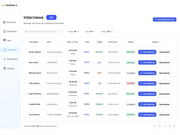
Give recruiters a clear overview of candidate movement throughout the hiring process.
Organized candidates according to their current position in the recruitment process.
Used consistent visual treatment for stages and candidate states to make progress easy to understand.
Made it clear how candidates can move from one stage to the next.
Recruiters can quickly understand pipeline progress and identify where candidates currently stand in the hiring process.
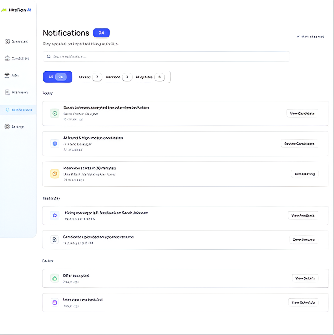
Keep recruiters informed about important updates and time-sensitive activities without requiring them to constantly monitor different areas of the platform.
Focused the notification experience on updates that require awareness or action, rather than surfacing every activity.
Used visual distinction between unread, read, and higher-priority notifications to help recruiters identify what needs attention.
Included enough information within each notification to help recruiters understand the update before deciding whether to open it.
The notifications experience provides a centralized view of important updates, helping recruiters stay informed without adding unnecessary interruptions to the hiring workflow.
Prioritizing essential information makes complex workflows easier to understand and navigate.
A clear hierarchy helps users identify what matters first and understand where to focus their attention.
AI can reduce manual effort and surface useful recommendations, but users still need context and control to make confident decisions.
Thoughtful trade-offs help balance clarity and functionality while ensuring users still have the information they need.

A premium skincare website designed to simplify product exploration, highlight brand storytelling, and create a visually engaging shopping experience across devices.